Regular home user here, still learning my way around NetSpot. Why do the"Issues with SNR" from the Troubleshooting section and the regular “Signal-to-noise ratio” heatmap look so different when both messages are about SNR?
The difference is all about how they display the data. The regular “Signal-to-noise ratio” heatmap displays raw, precise physical measurements using a smooth color gradient across the entire floor plan. It just delivers the raw facts without judging if they are good or bad for your Netflix streaming.In contrast, the “Issues with SNR” troubleshooting map acts as an analytical tool, highlighting only specific zones where the signal drops below a critical threshold.
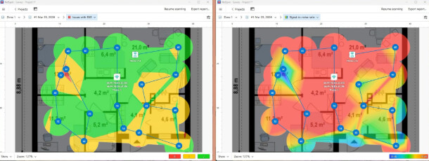
Signal-to-noise ratio = raw dB values across the apartment Issues with SNR = only the risky/problem areas based on thresholds
They serve different purposes. The regular Signal-to-Noise Ratio map shows the real SNR values across the space — just the raw RF picture, no judgment attached. The “Issues with SNR” is your troubleshooting tool. It highlights only the areas where SNR drops below the threshold that actually matters for your use case. There you can set your own critical / acceptable thresholds, which is important because those values depend on what you need the network for. What’s okay for light browsing may still be unacceptable for calls, conferencing, or other more sensitive tasks. That’s what makes it useful for people who understand Wi-Fi a bit.
@nirvanachicks_0990 That actually clears it up a lot.